Start by engaging a beverage branding and packaging design expert.
That’s because we know how to put on a brand architect hat when creating packaging for the same winery across different wines and price points.
Yes, we still deliver bottles that stand out on the shelf. But we also take (very seriously) the need to build meaning, consistency and trust across a wider portfolio.
We’ll give you an example.
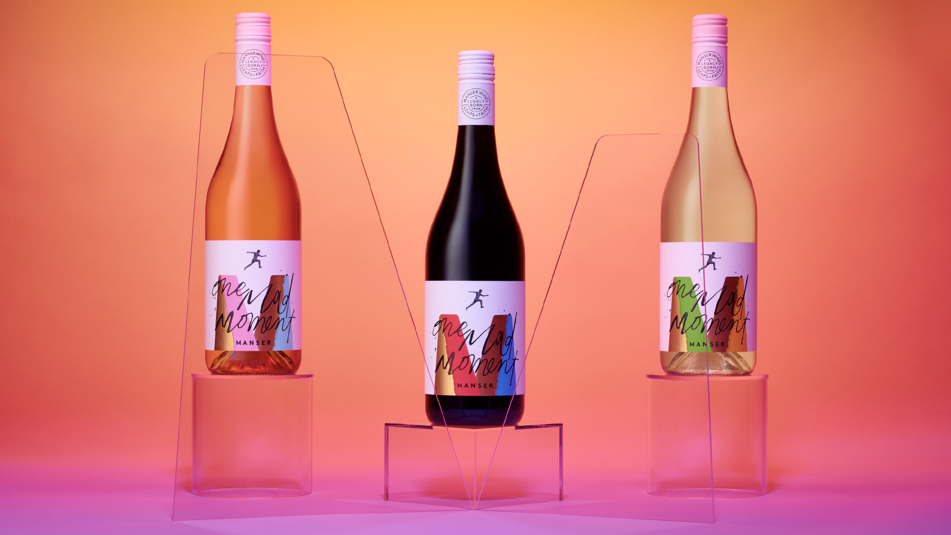
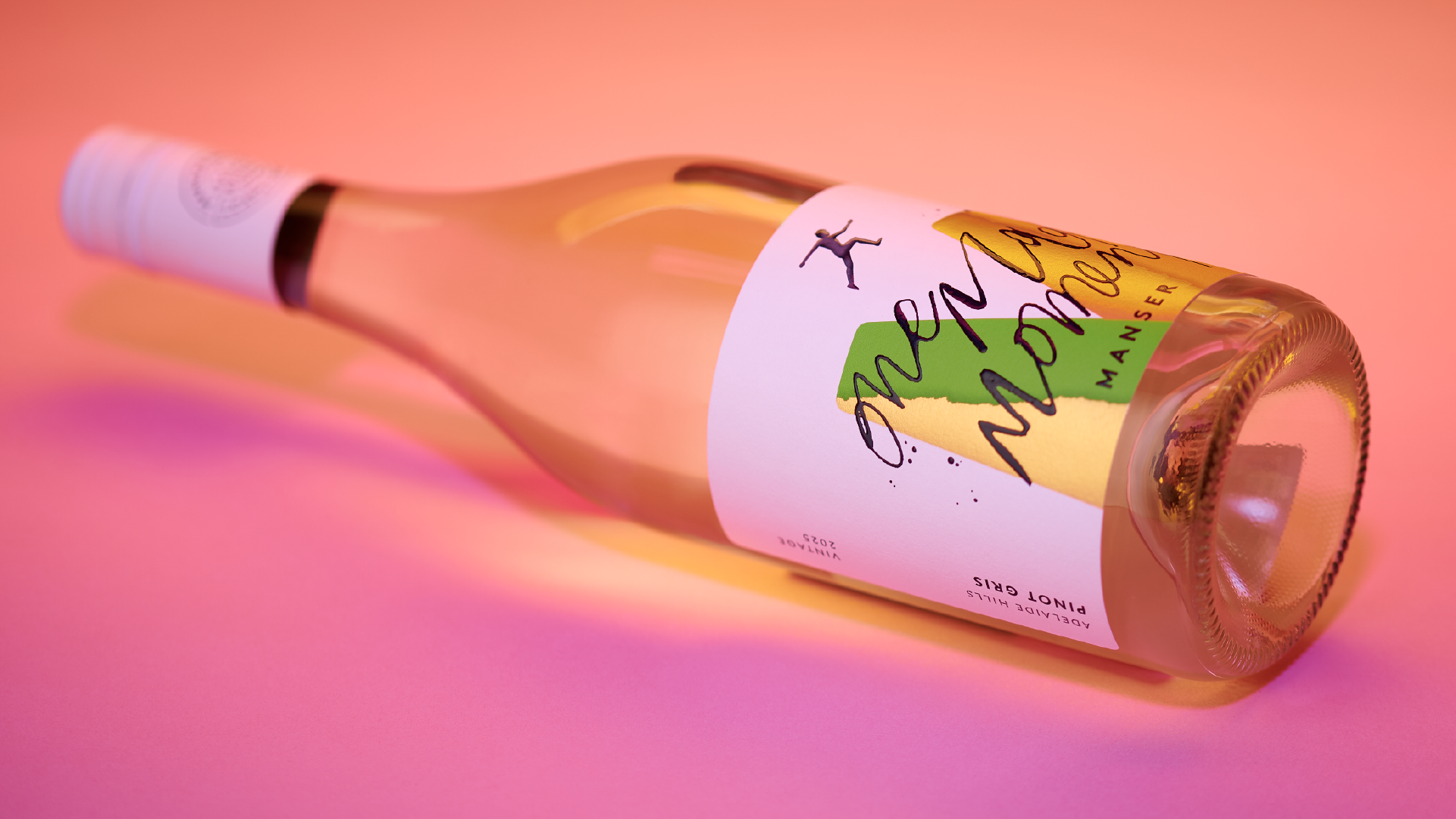
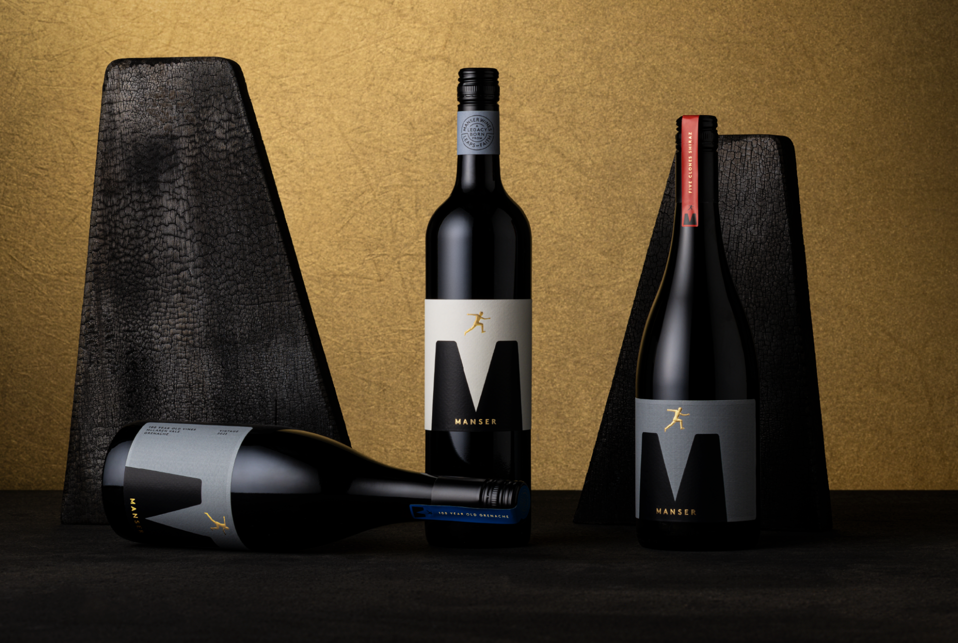
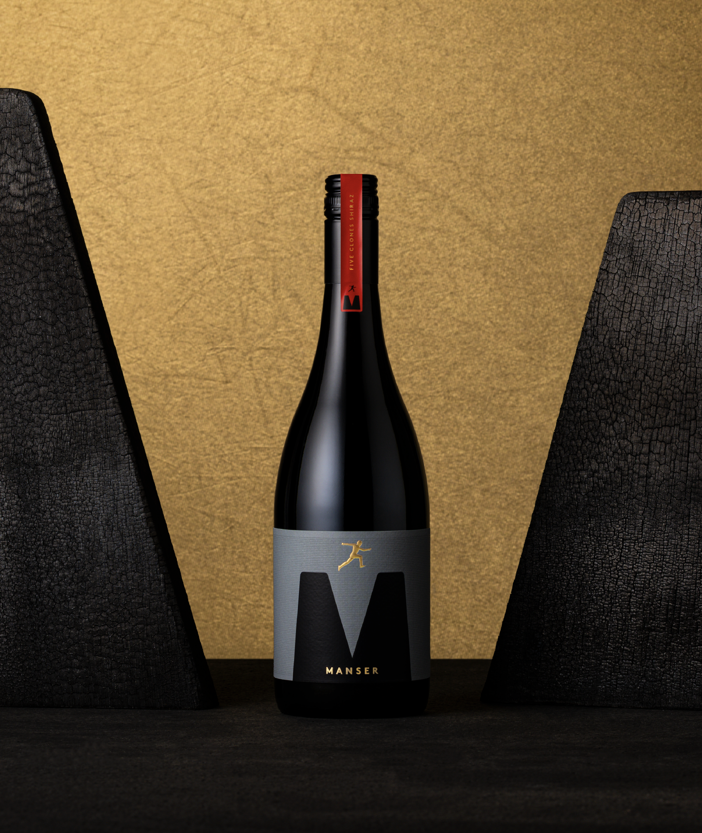
Last month, we shared with you Manser Wines’ entry-level One Mad Moment series. This month, Manser is debuting a premium range of “small parcel” wines called Five Clones, Dad’s Cut and 100-year-old Vines Grenache.
Obviously these premium wines couldn’t look or sound the same as One Mad Moment, yet they still needed to feel related. And while one had to be a level above, the other couldn’t feel lesser, either.
This is where being drinks packaging design specialists really kicks in.
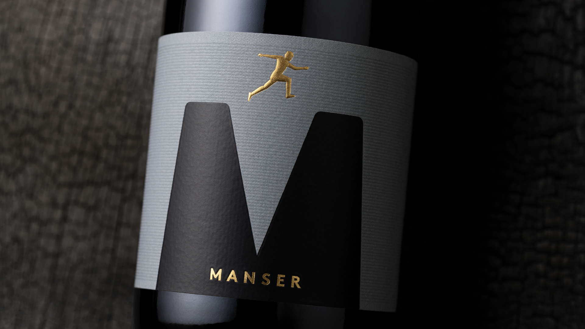
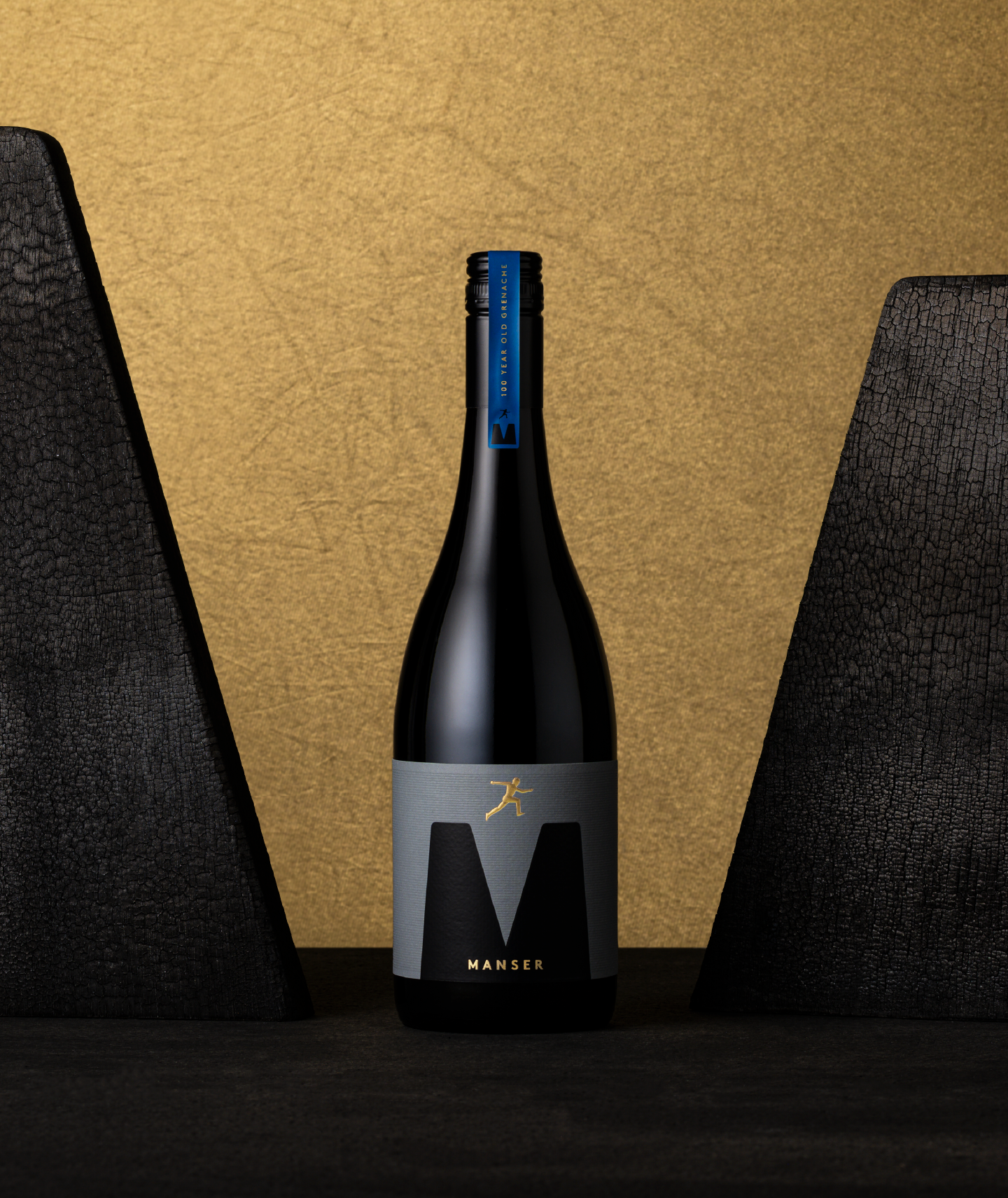
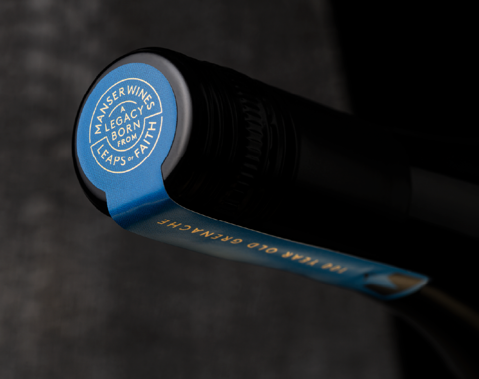
We set about creating this fine line between distinction and synergy through visual cues that signal price without saying it. Like the jumping figure brand icon, which is used on labels in both ranges, being sculpturally embossed and beautifully finished with a custom grain in paper for the premium bottles.
The end result is very different to One Mad Moment. It’s simple, minimal, luxe and timeless.
As drinks branding design specialists, we know how crucial it is to get this right. Entry-level wines can easily dilute premium wines with the wrong packaging. It’s easy for consumers to get confused and lose trust, or for premium wines to feel overpriced.
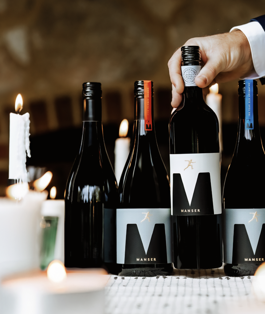
“When you get it right, entry-level wines will build volume and a loyal following and the entire portfolio will feel coherent and intentional.”
We’re not just designing labels here at Voice—we’re brand building and creating long-term equity.
Keen to talk drinks branding?