

It’s not every day that a company with a revenue of around $1.4 billion trusts you to do a total re-brand.
So we were thrilled when South Australia’s electricity distributor SA Power Networks—one of the largest organisations in the state—got us on board to not only change the company’s brand image, but to communicate the complexities of the industry to stakeholders, regulators, government and staff.
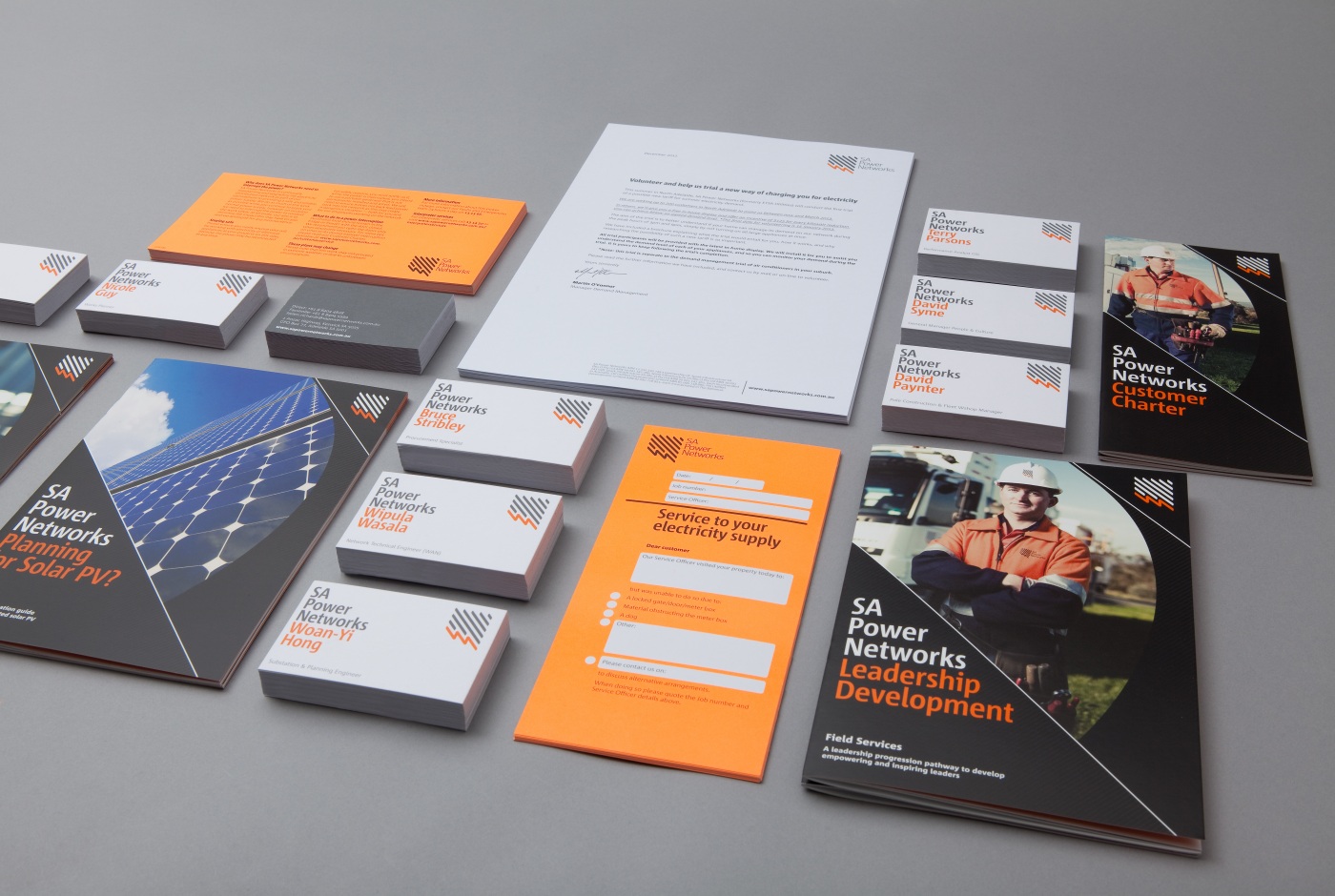
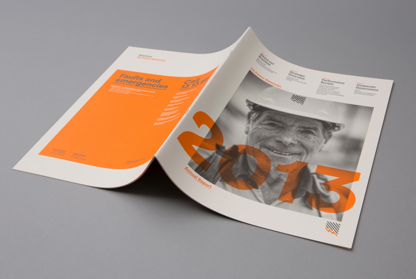
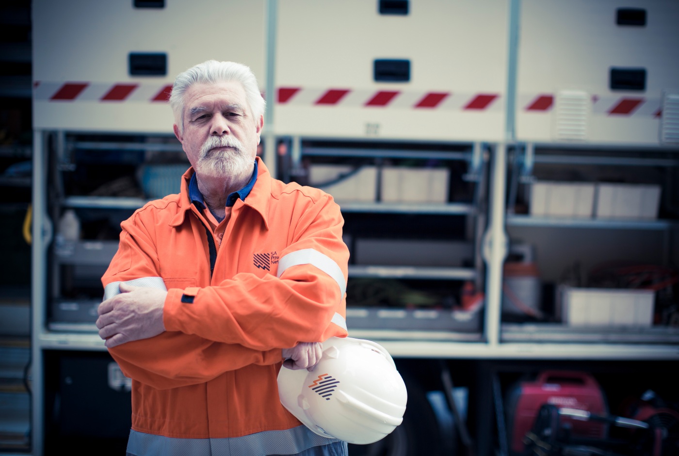
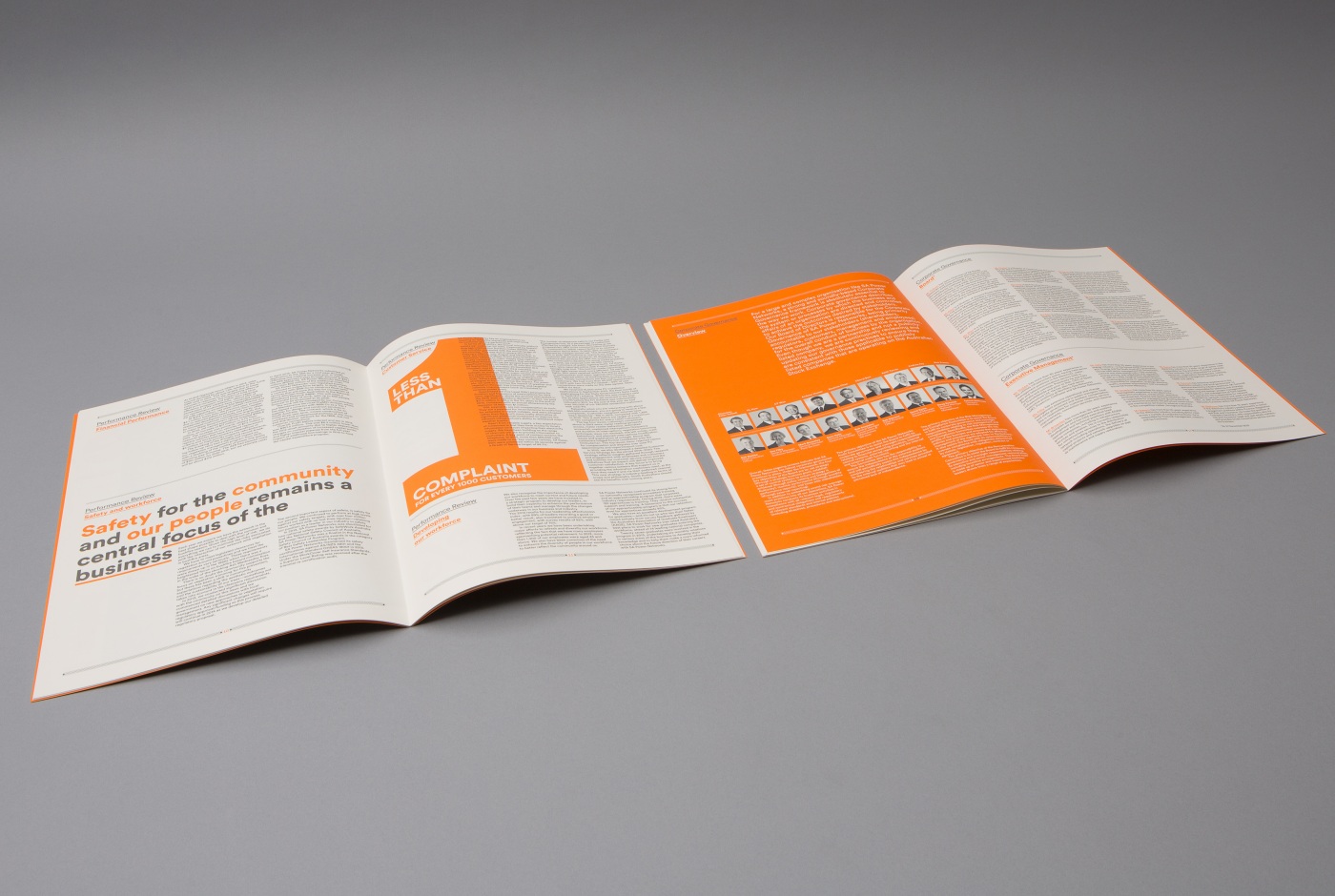
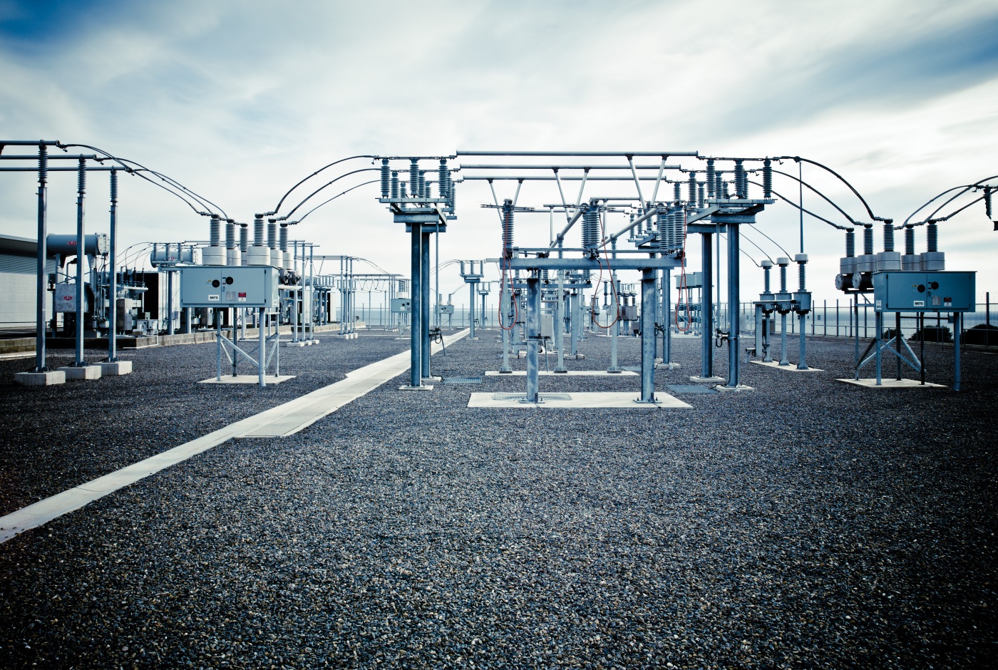
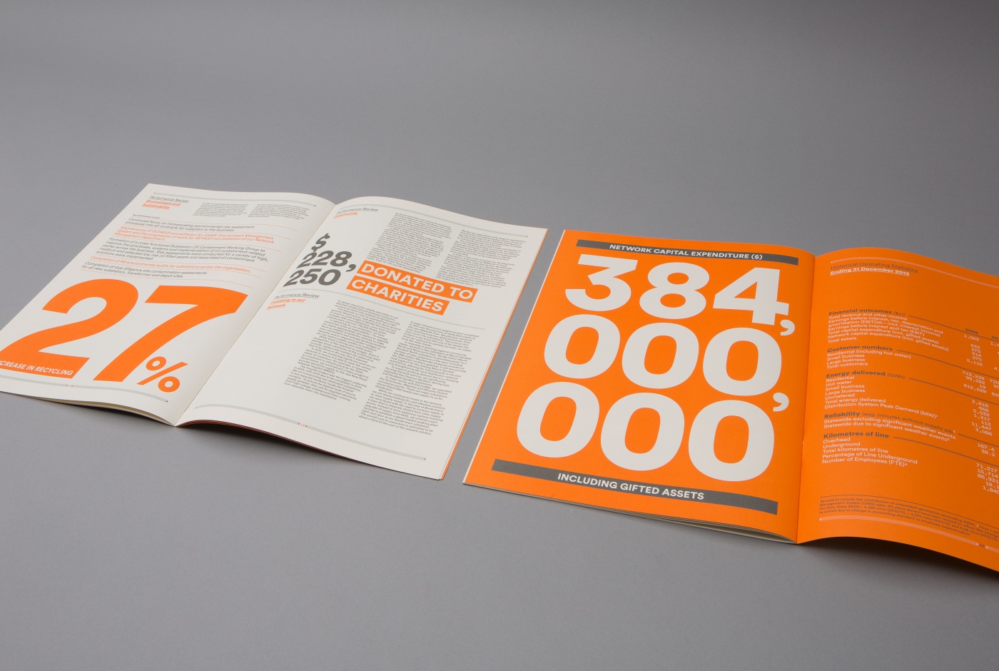
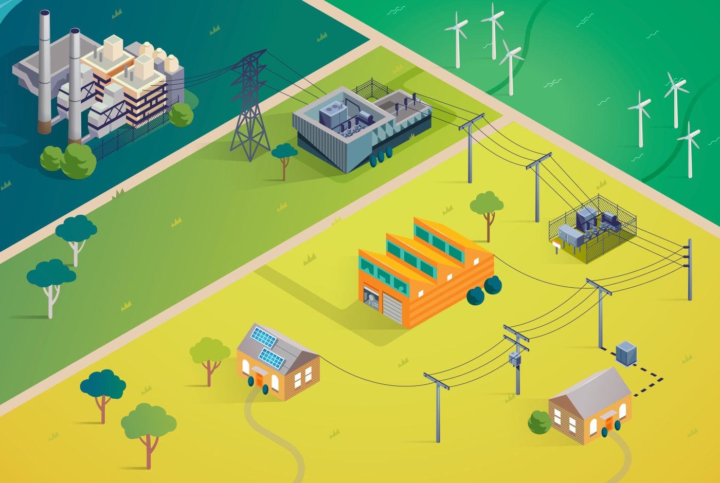
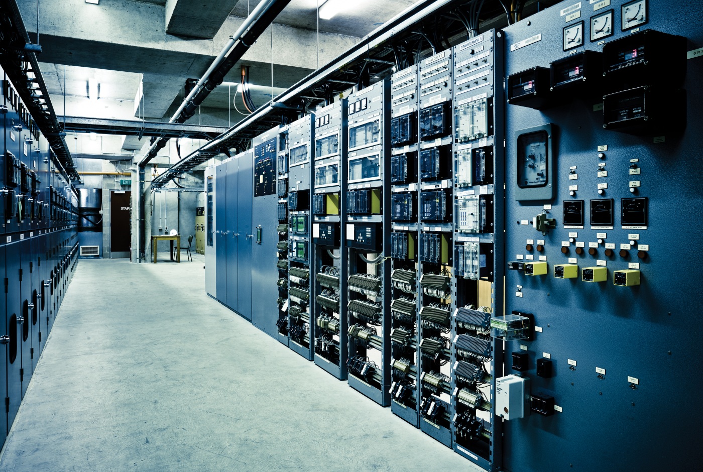
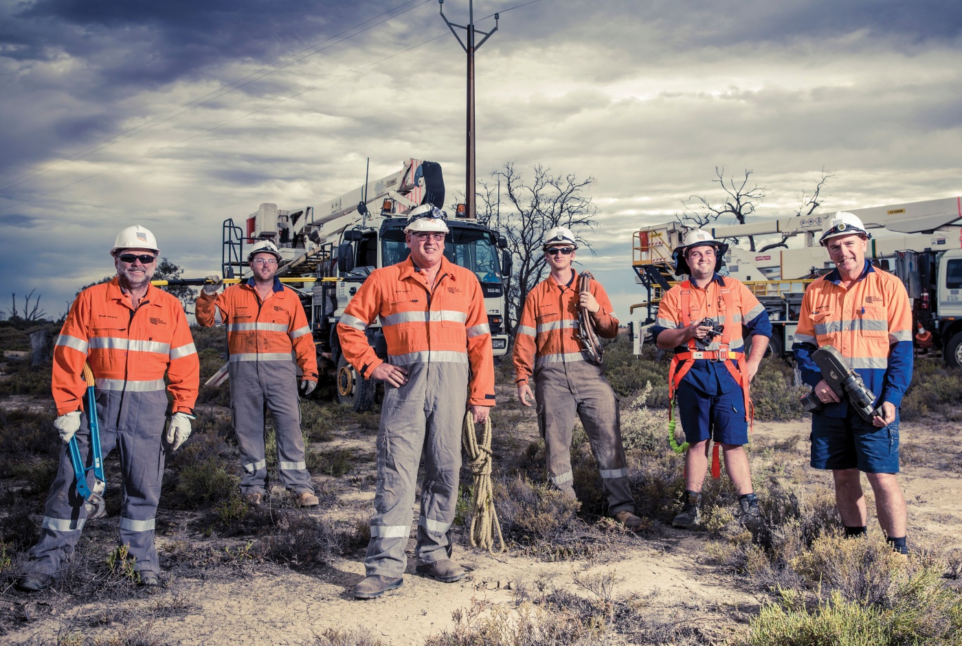
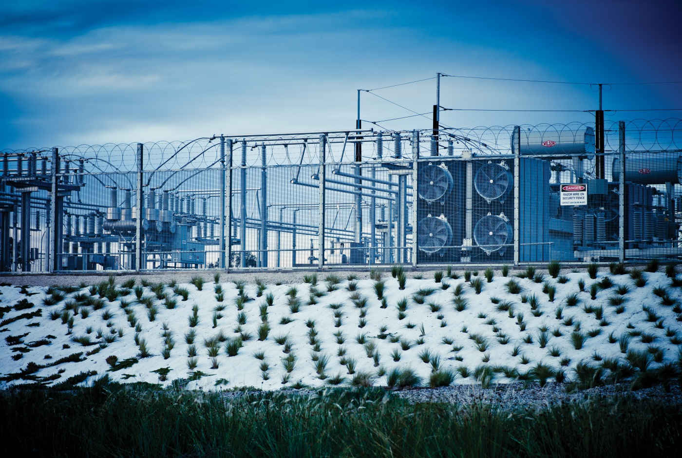
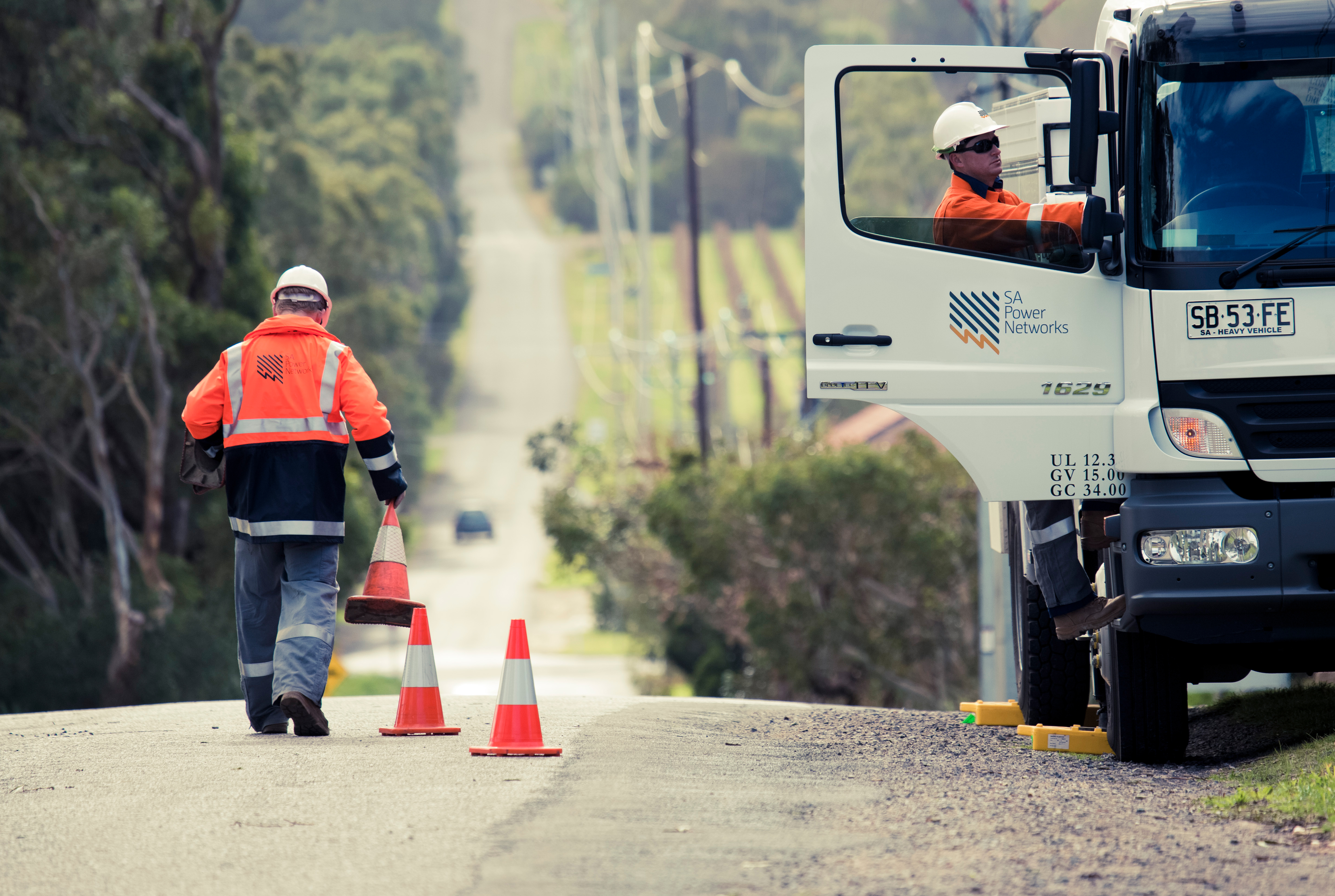
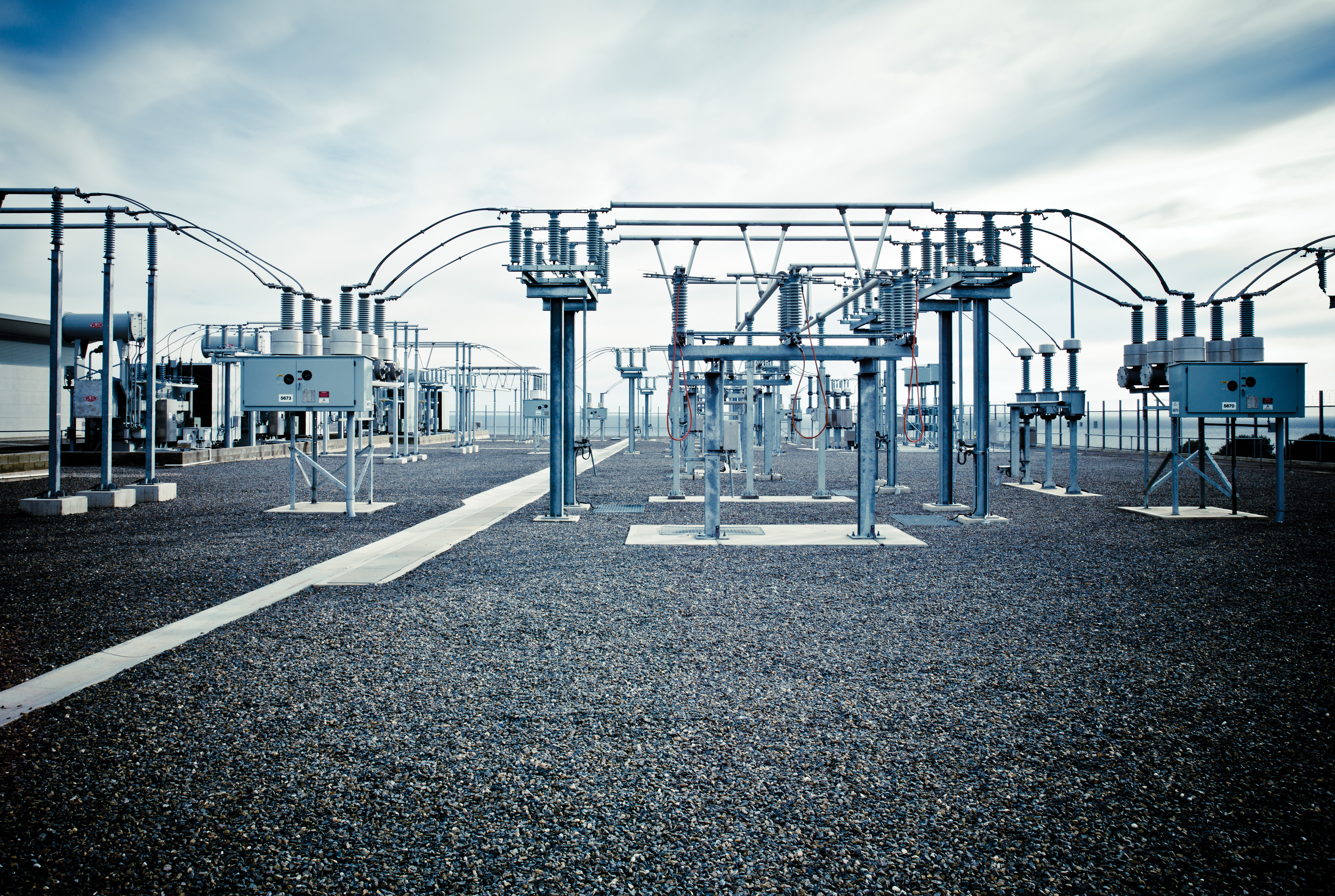
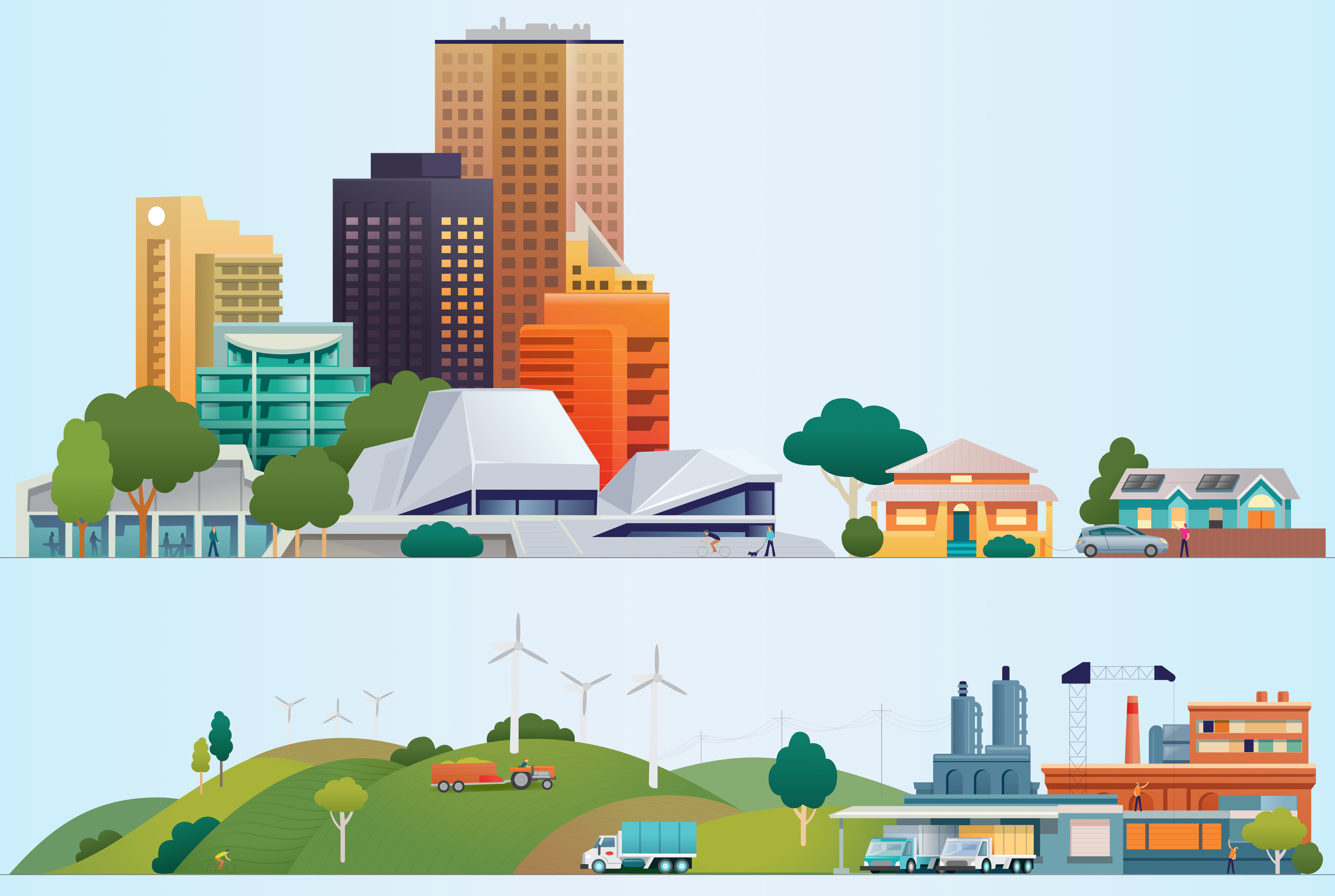
We’re not going to lie: this was not an easy gig. It’s always a challenge to develop engaging and clear communications when the sector language is so dry. So to make the information crystal clear and palatable to the masses, we produced a variety of photography, illustrations and graphics that made a tired infrastructure appear simple, engaging and modern.
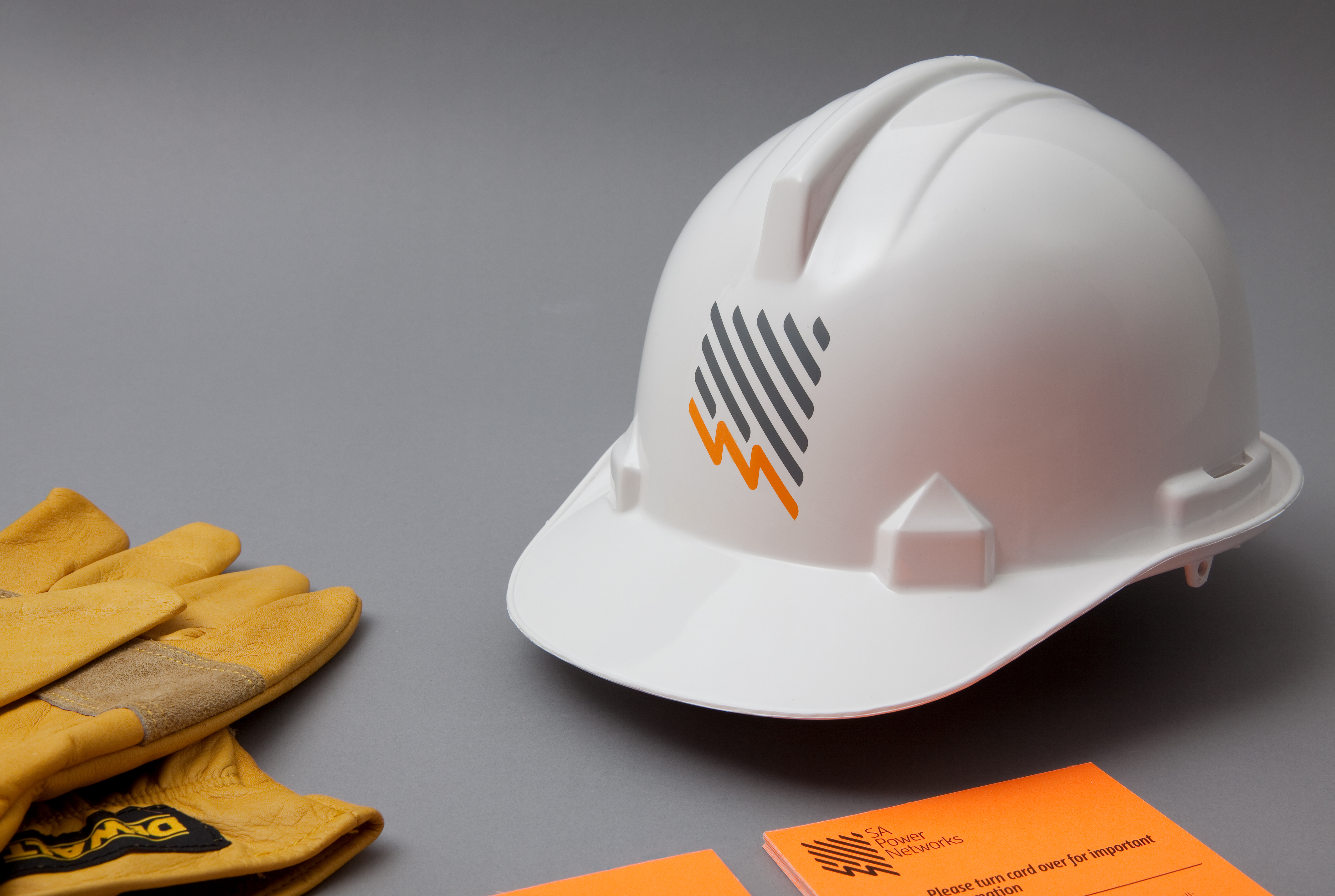
While the most valuable and visible aspect of the brand was the logo, which is used relentlessly, SA Power Networks was also committed to developing a better culture internally, with a focus on greater safety and efficiency.
A colossal job that kept us insanely busy and gave us a few grey hairs, but we’re proud of this work and the results it yielded (and continues to yield).


